The art of making complexity disappear
A dual-display smartphone with two radically different screen technologies sharing a single, seamless body.
The brief was deceptively simple. The execution was anything but.
OVERVIEW
Two faces. One object.
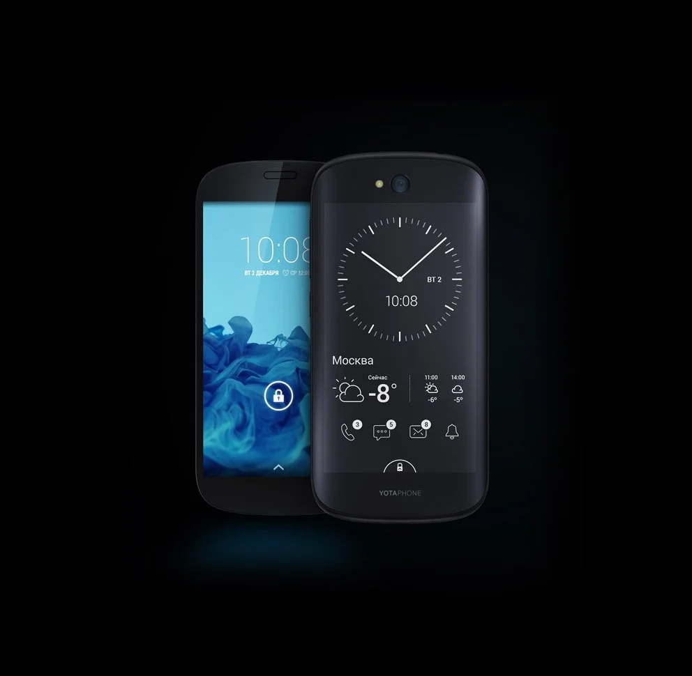
The YotaPhone 2 was a smartphone that challenged the idea that a phone should have only one screen. Its front had a regular AMOLED display. The back featured curved glass with a laminated e-ink screen that was always on, always readable, and always available. Two very different display technologies combined into one device.
The idea was bold. But for a product like this to succeed, not just technically, but as something you hold, it had to feel like a single, well-thought-out device. Not a compromise. Not a gimmick. A device that clearly knew its purpose.
That was the challenge for color, material, and finish.
"Most people wouldn't realize the complexities of creating and executing all those processes on a part that seems so simple."
THE BRIEF
Hired to solve the unresolvable
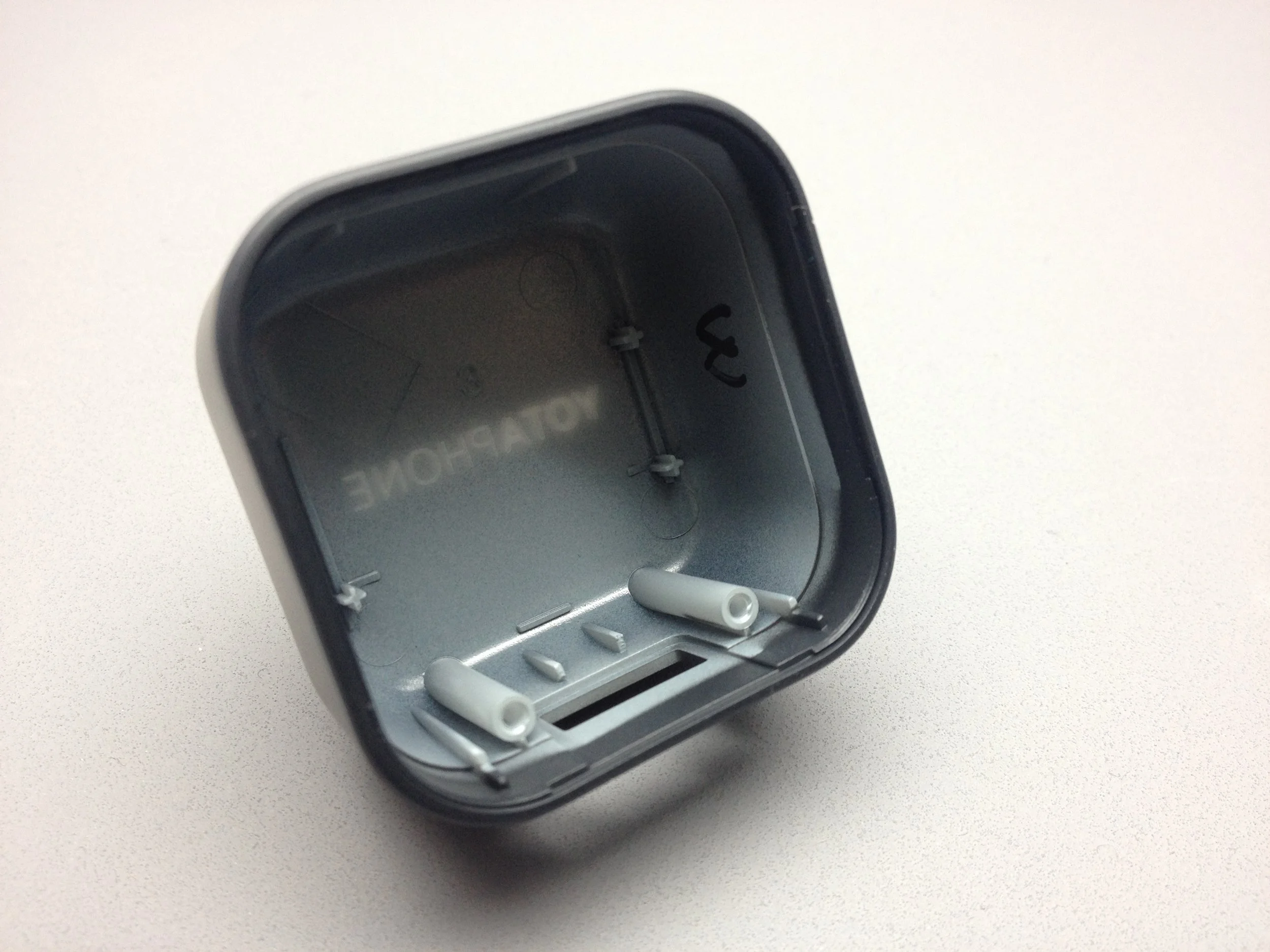
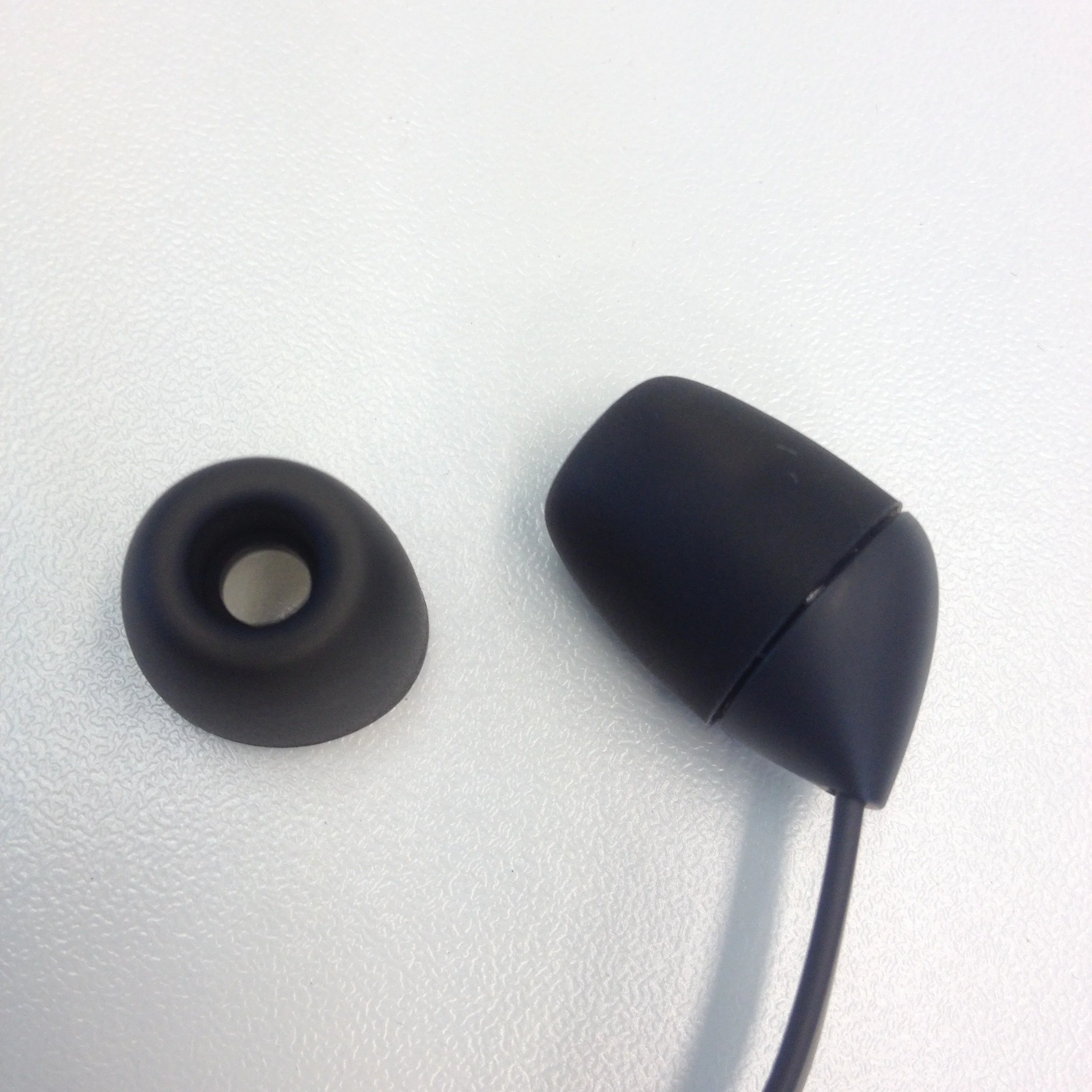
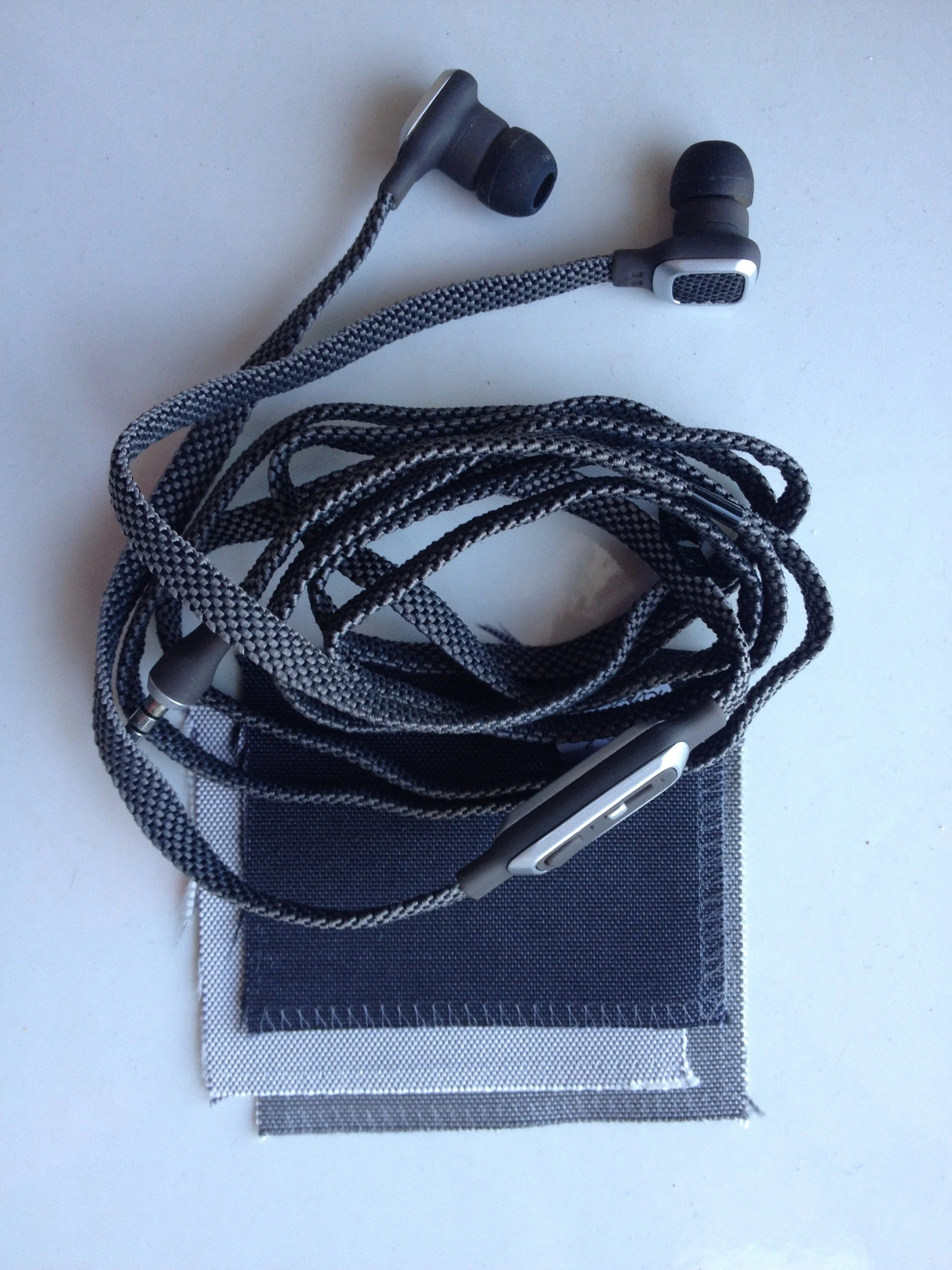
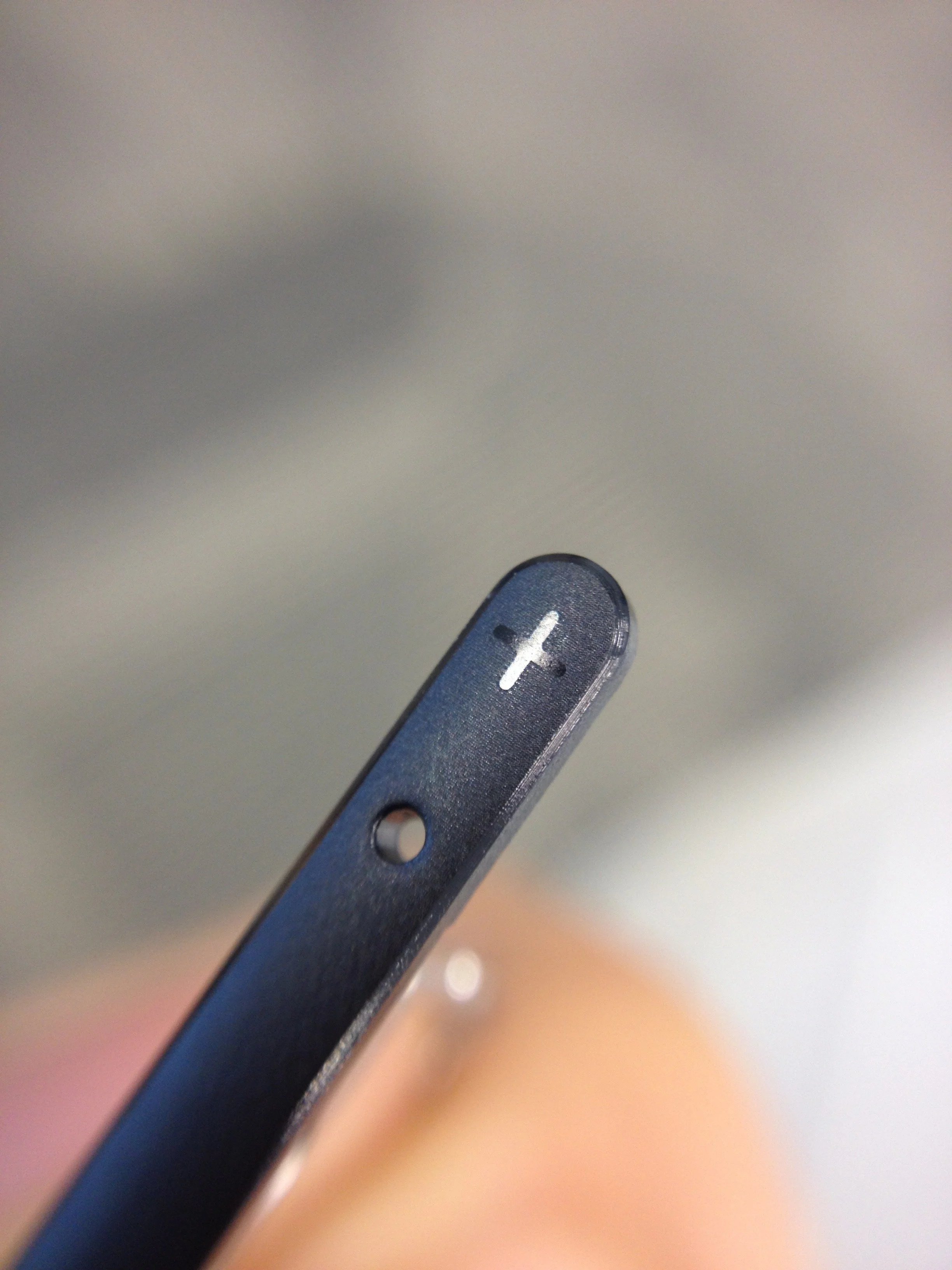
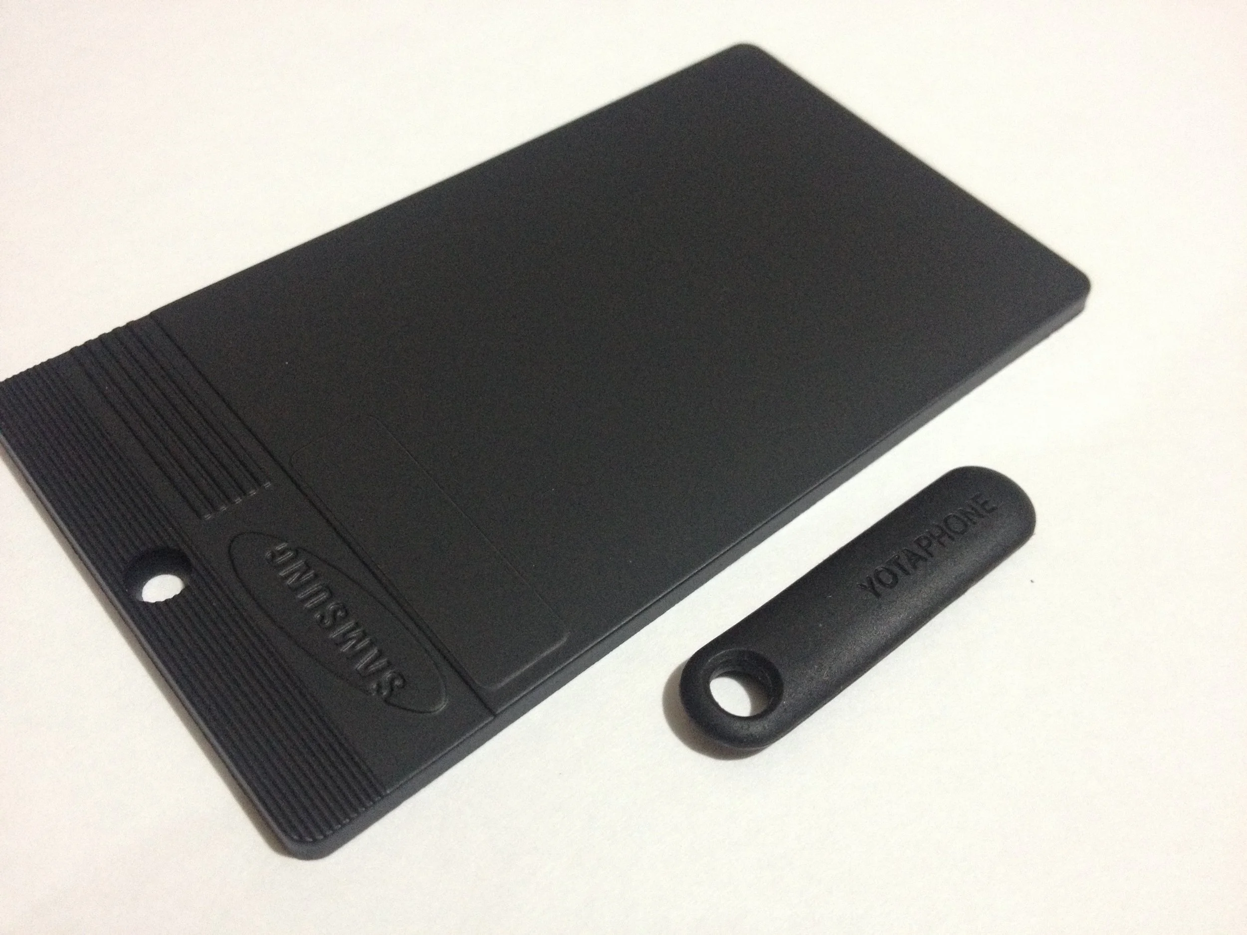
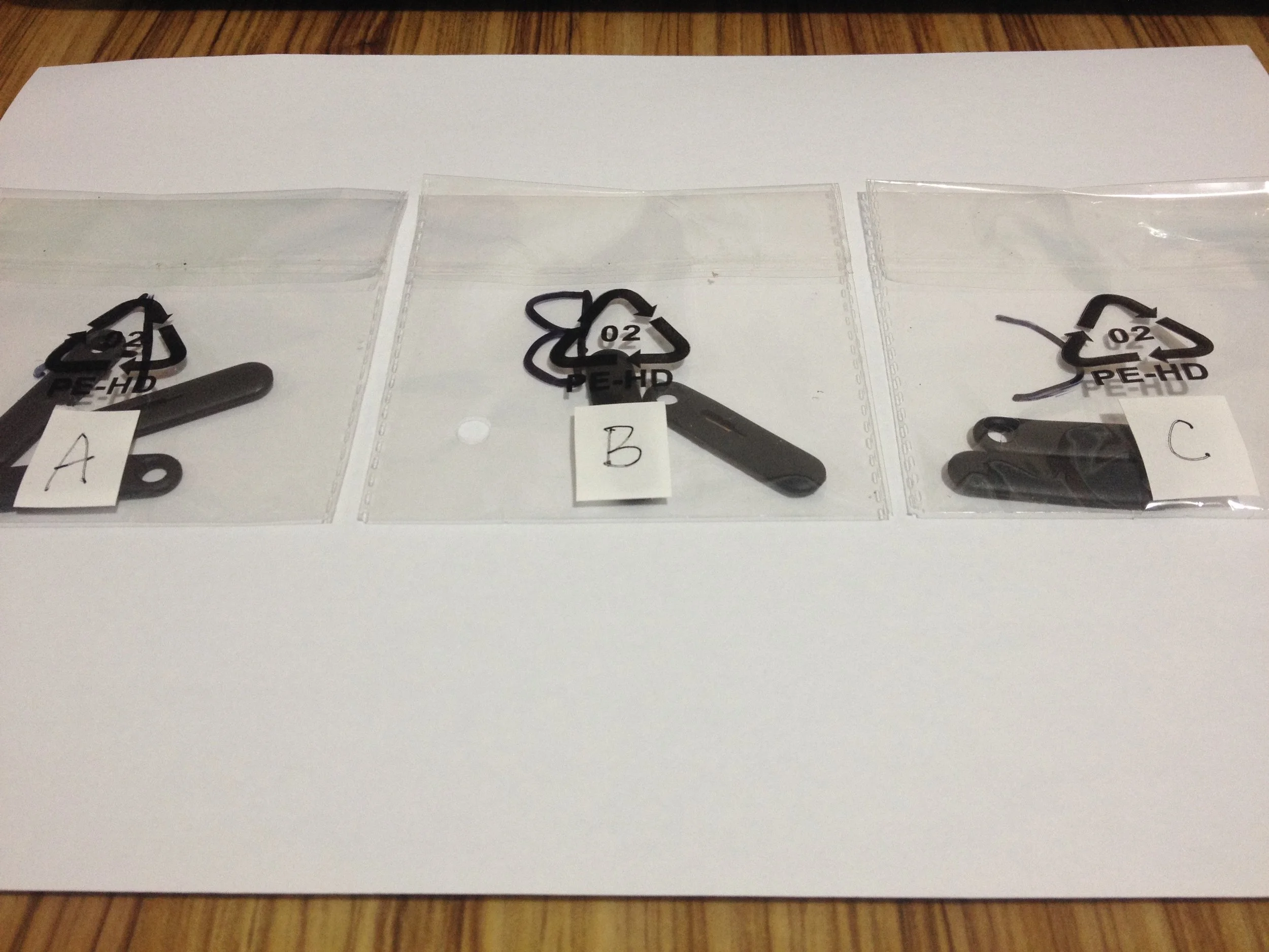
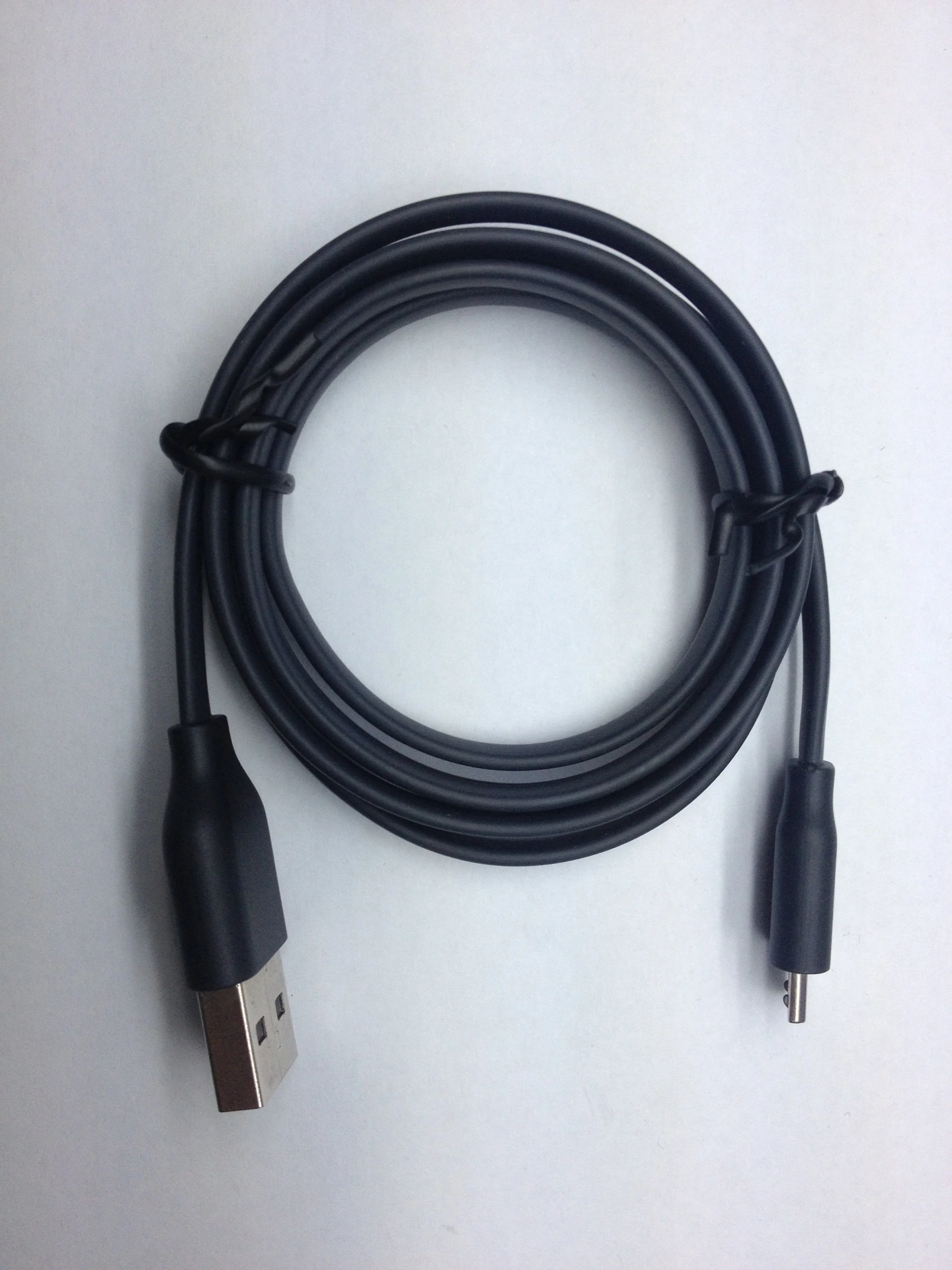
I was brought in as an external CMF Lead by Yota's industrial design director, engaged specifically because the project demanded a level of material and process expertise that required dedicated, accountable leadership. My scope was the total package: the phone itself, the charging adapter, the USB cable, the earphones, and even the SIM ejector pin. Every surface the user would touch, hold, or notice was within my remit.
From day one, the design director was direct about the central challenge: the rear glass cover had to match the e-ink display color seamlessly. No visible seam. No optical mismatch. A surface that looked, from any distance, like one continuous material.
It sounds simple and straightforward. The process to achieve it was not.
THE PROBLEM
A moving target
The e-ink display had been laminated to a curved Corning glass, a process itself uncommon at the time. Before lamination, the dark e-ink panel looked normal. Just a dark grey panel without any tints or shades. After lamination, something changed: a subtle blue reflection appeared, visible only at certain angles, vanishing at others.
The problem was not a static mismatch. It was a shifting one. When the blue reflection caught the light, it collided with the dark silk-print color on the rear glass cover, creating a sharp, visible edge, a line that exposed the boundary between two components that were supposed to look like one.
The team had been working to eliminate the reflection at the source. Engineers, material specialists, and multiple stakeholders across locations — none had found a resolution. By the time I joined, the blue reflection was accepted as a permanent characteristic of the lamination. The task shifted: instead of removing it, we had to design around it.
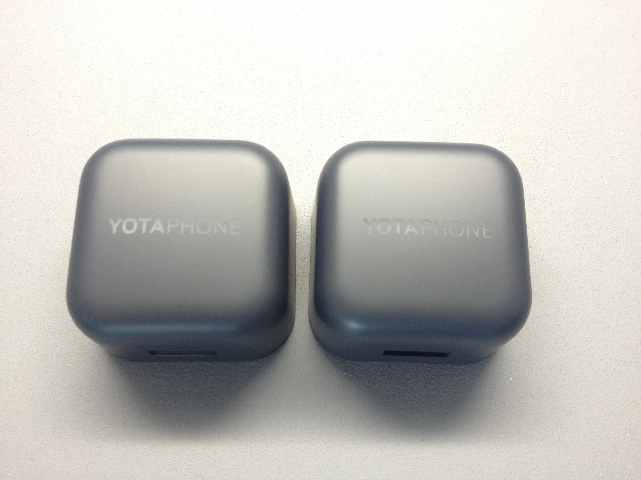
First, we needed to define what success would look like and agree on a realistic end result. My first step was to use the laminated e-ink as the “color target.” I took it to the model maker to recreate the color, including the blue reflection. Once we matched the color and effect exactly, we built a full appearance model of the phone and selected a realistic color match between the e-ink and the rear glass.
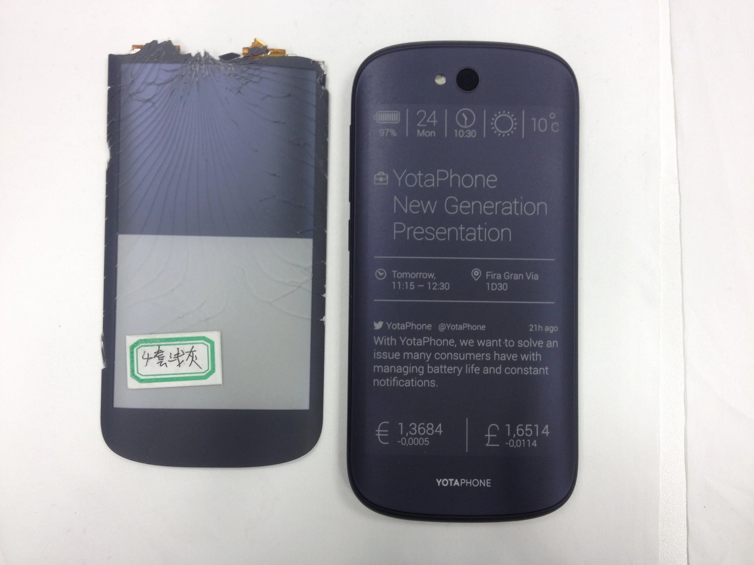
The broken sample on the left is the original “color target” for the e-ink display. The device on the right is the appearance model, also called the CMF mockup, which serves as the ideal and realistic reference. The blue reflection from the e-ink display on the color target creates visible edges, while on the appearance model, the edges nearly disappear, resulting in a more seamless appearance.
The problem wasn't color. It was perception — a surface that behaved differently depending on the light, the angle, the moment.
THE PROCESS
Four months. Four countries. One solution.
I was the only CMF designer on this project — coordinating between my design manager in Finland, the CEO in Russia, and vendors in China and Taiwan, while based in Singapore. Every week, I was on a flight. Every iteration traveled across borders before it could be evaluated.

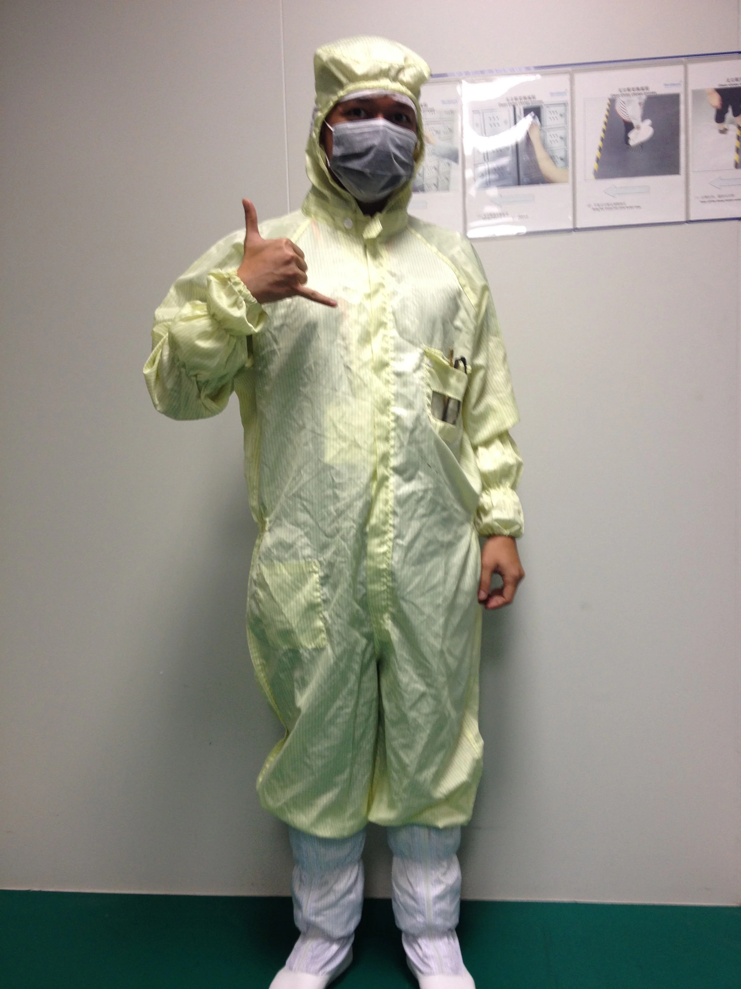
That’s me visiting Corning’s cleanroom facility in Taichung, Taiwan, to learn about glass engineering processes and co-working with their materials experts.
We use the appearance model as the archetype to guide us. The team's first instinct was to adjust the silk-print pigment, adding a blue tint to the dark silk-print color to absorb the reflection. We tried multiple shades. The result was a color that read as permanently cool grey, regardless of angle. It looks even worse than before. The goal was a surface that mirrored the e-ink behavior: blue where the e-ink was blue, neutral where it was not. A permanent tint solved nothing.
I then recommend a subtle optical NCVM (Non-Conductive Vacuum Metallization) coating. A thin, precisely controlled optical coating on the rear of the glass, applied before the dark silk print, that would introduce the same angular blue shift the e-ink displayed. The glass would no longer fight the reflection. It would echo it.
The proposal was rejected. Cost, and the perceived difficulty of controlling NCVM color consistently at production scale, made it untenable at first.
So we continued iterating with adjusting the silk-print process. The pigment adjustments continued to fail. Eventually, with no remaining alternatives, the team returned to my recommendation. The first NCVM samples came back too strong, the coating was visible and heavy. But the principle worked. We refined the coating weight through several more iterations, dialing in the exact angular shift to match the e-ink's behavior under the same lighting conditions.
THE RESULT
Approved. Shipped. Close enough to matter.
After months of traveling and juggling across different time zones, I was worn out and decided to take a short break. While off duty, I heard the news: we had finally found the right balance between the silk-print color and the NCVM coating. Even better, both the design manager and the CEO had approved it. I felt relief before pride. Four months of weekly travel, failed attempts, a rejected proposal, and a stubborn problem had finally come together into something simple and right.
I'll be honest: when I first heard we had a result, I was skeptical. We had spent too long on the problem to trust the good news easily. It wasn't until my design manager called to confirm the CEO's approval that I allowed myself to believe it. What I felt in that moment wasn't triumph. It was exhaustion, and then, slowly, relief.
The NCVM coating made it into the final shipped product. The cover glass and the e-ink display now responded to light in unison — neutral in flat light, shifting blue together when the angle changed. The visible edge was gone. Two separate components became one continuous surface.
It would be misleading, however, to call it a perfect match, and anyone who has worked with e-ink will understand why. The display's color is not a fixed value. It shifts with temperature, viewing angle, and ambient light. It is, by nature, a moving target. What the NCVM treatment achieved was not a single locked color match, but a consistent optical harmony across the range of conditions a user would actually encounter. We landed at roughly 90–95% of the way there, close enough that the eye reads unity rather than difference.
In CMF, that distinction matters. Chasing the last five percent on a target that cannot stand still is not a failure of execution. It is an honest account of what materials can and cannot do. The result was not perfect. It was correct, and in a problem this complex, those are not the same thing.
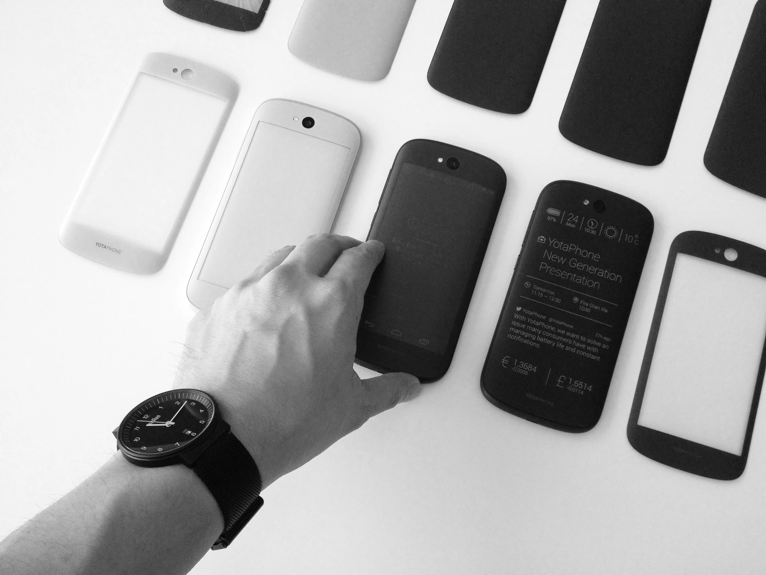
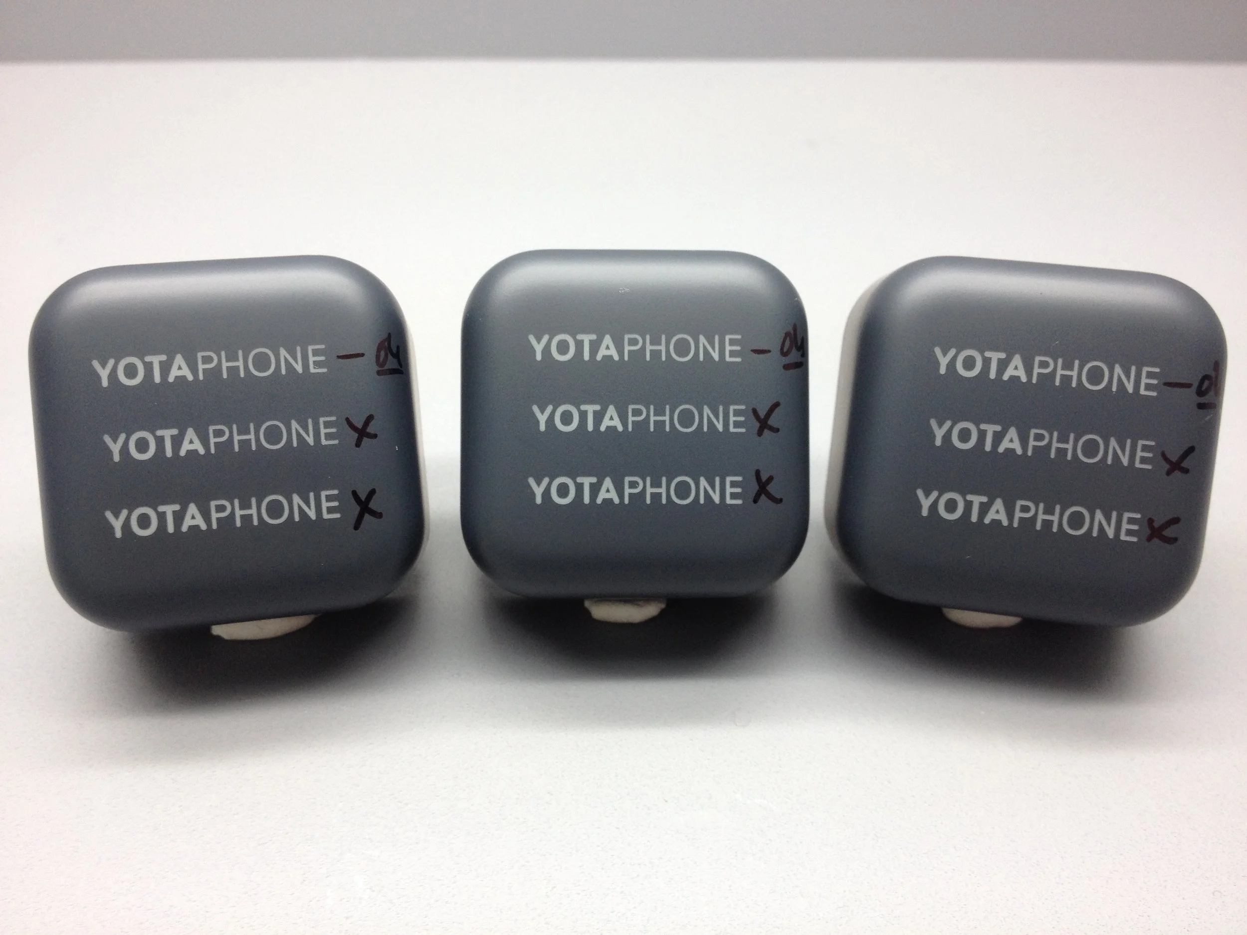
Iteration color sample development process.
THE WHOLE NINE YARDS
CMF as a system, not a surface
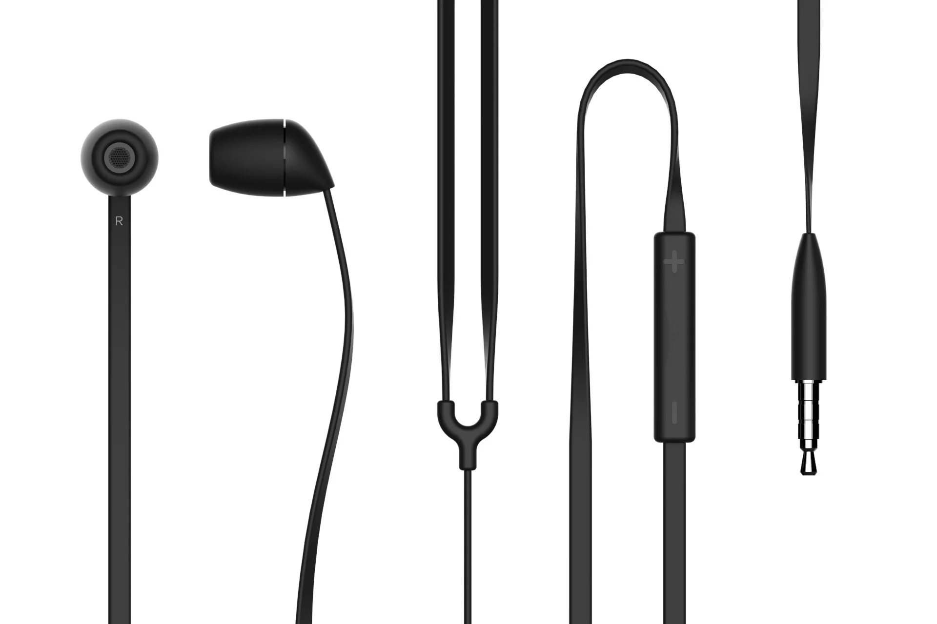
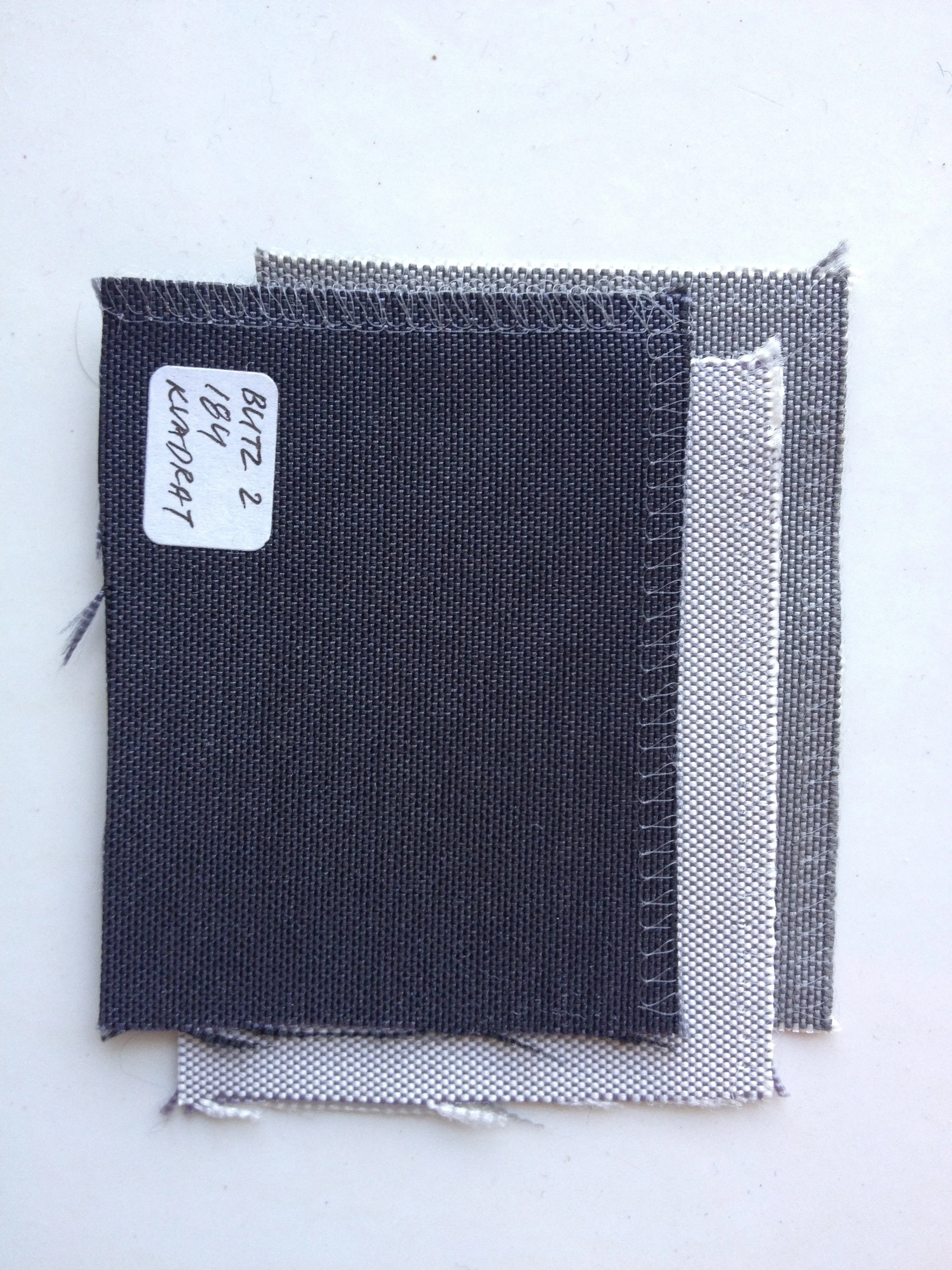
The glass color match was the defining challenge, but the project demanded more. Every item in the YotaPhone 2 box carried my CMF direction: the charging adapter, the USB cable, the earphones, the SIM ejector pin. Each piece was resolved with the same design language — minimal, refined, coherent.
It is not easy to design a phone. It is even harder to design everything around the phone and have it feel like it came from the same hand. That full-system thinking — from the hero device to the smallest accessory — is what complete CMF ownership requires.